Five points on typography
Fabio Santaniello Bruun · · Automatically translated from Italian
Let’s skip a detailed history of typography and how the use of quill pens influenced the thickness of strokes and the slant of serifs, and instead, let’s get straight to the point in this ready-to-use guide to the basics of good typography. This is a concise and effective handbook of simple rules to follow and remember, with helpful links and illustrations to aid you in your future projects.
Before we begin, it’s important to make a preliminary statement. Typography is widely and often underestimated today, both in academic and school settings, and in professional environments, whether public or private. With the advent of computers and text editors, everyone seems capable of writing a few lines on a screen, using the default font (or, if they’re lucky, choosing a font; otherwise, the ubiquitous Comic Sans is often the default), and printing page after page of disorganized blocks of text. The professions of typography and graphic design have suddenly become accessible to the masses (much like photography with the advent of digital cameras), leading to often shameful and reprehensible results in communication, even at the institutional level. It only took one young person to show the United States that by changing the font used for government documents, they could save $234 million per year (CNN: https://edition.cnn.com/2014/03/27/living/student-money-saving-typeface-garamond-schools/). However, writing, and we can remember or forget this thanks to it, is the fundamental element in human history that has allowed us to distinguish ourselves from animals, as it has given us the ability to pass on our knowledge to future generations on a tangible and (almost) eternal medium. And this medium consists of two parts: a surface, and typography.
The letters, the words, the dots on the “i”s, the white space, the paragraph indents, the apostrophes, the ligatures, and so on, are all the tools that our most important discovery has made available to us for communicating with others, and the proper use of these tools is of fundamental importance for the impact of the message we want to convey, and the impression of ourselves that we want to create.
Let’s start with five tips from >Matthew Butterick. If you learn these five rules of typography, you will be a better typographer than 95% of professional writers and 70% of professional designers (and the rest of Matthew’s instructions on his website will “bring you to the 99th percentile in both categories”).
It only takes ten minutes – five to read them carefully once, and five to reread them. Ready? Let’s go.
-
The typographical quality of your document is largely determined by how the body text appears. This is because there is significantly more body text than anything else. Therefore, focus your efforts on making the text look good, and then worry about everything else.
-
The point size is the size of the letters. For printed materials, the most comfortable range for reading is between 10 and 12 points. On the web, the range varies between 15 and 25 pixels. Not all fonts appear the same size at a given point size, so be prepared to make the necessary adjustments.
-
The line spacing is the vertical distance between two baselines (the imaginary lines on which the letters rest). It should be between 120% and 145% of the point size of the text.
-
The line length, or the width of the text block, should be approximately in the range of 45-90 characters per line, or about two and a half alphabets, plus or minus; this results in left and right margins of approximately 4 cm on an A4 sheet, which is almost double the standard margins in word processors: abcdefghaijklmnopqrstuvwxyzabcdefghaijklmnopqrstuvwxyzabcdefghilmno.
-
Finally, the choice of font. The best, fastest, and most effective approach is to ignore the pre-installed fonts on your computer and purchase professional fonts (although it’s true that Google Fonts currently offers sets of professional fonts for free, which we’ll discuss later); of course, it is possible to achieve good typography with system fonts (Mac systems have Helvetica installed, which is a good starting point). Under no circumstances, EVER, should you choose Times New Roman or Arial. Only those who are apathetic and lazy choose them. Not typographers. Not you!
That’s all there is to it. Make these five rules a habit, and most of the work is done, and done well.
If you want to delve deeper and reach the 85th percentile, you can download a >short guide extracted from Matthew’s work, which we are presenting with his permission. For Matthew’s complete work, the website is >this.
Now, let’s move on to some fonts (out of the many available) that Jeremiah from >Typewolf suggests.
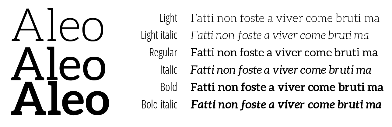
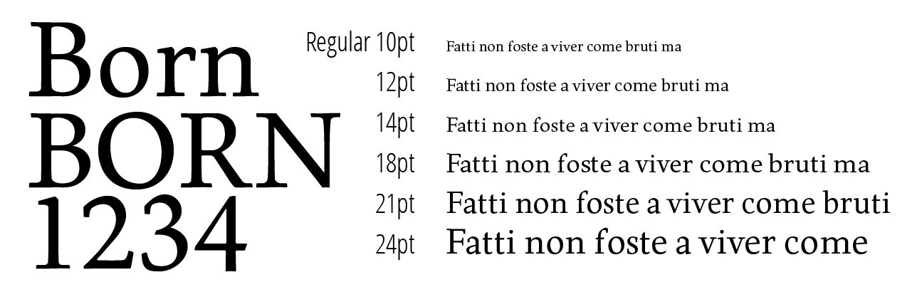
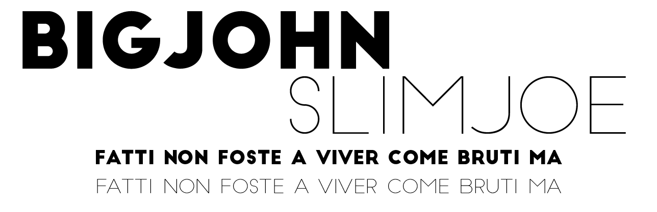
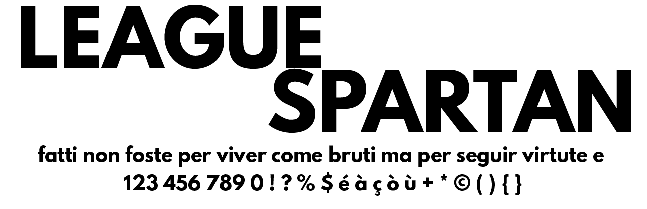
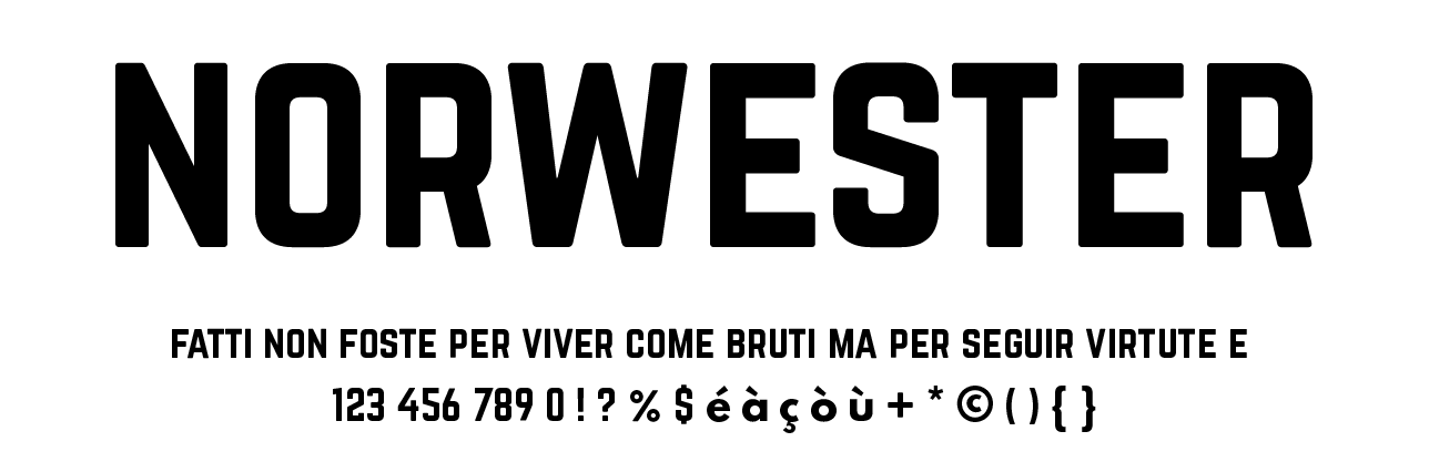
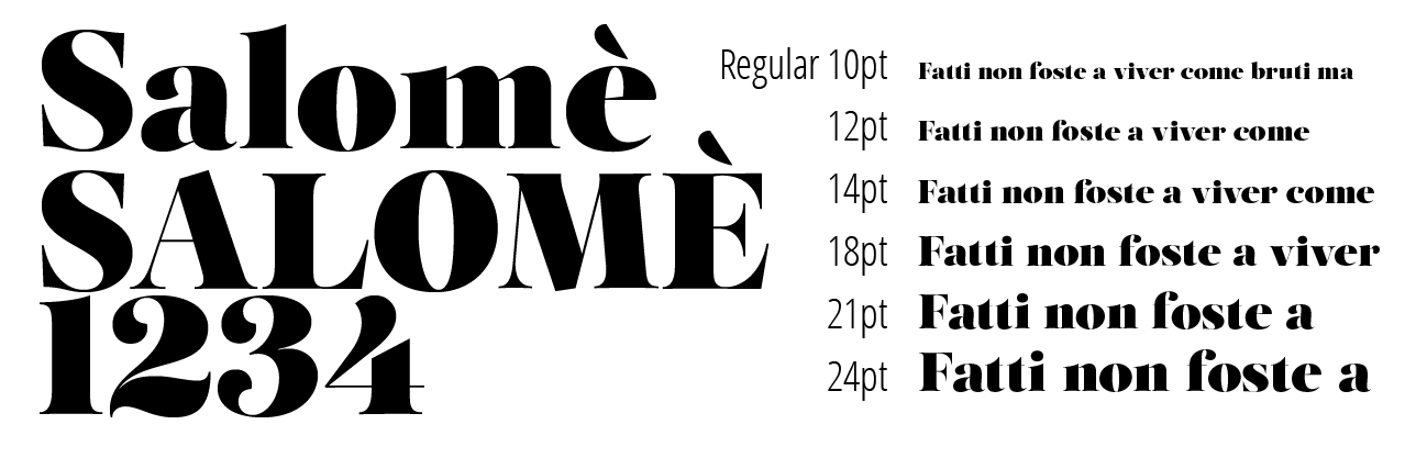
You can download the zip file containing all the .otf files from >here.
As mentioned, Google Fonts offers a great selection of very interesting font families that you can synchronize to your computer using >SkyFonts. Our selection is:
- ABeeZee
- Abel
- Abril Fatface
- Open Sans
- Roboto, Roboto Condensed, Roboto Slab
- Lato
- Source Sans, Source Code, Source Serif
- Raleway
- Droid Serif
- Merriweather
- Lobster
- Lora
- Oxygen
- Playfair Display
- PT Serif
- Arvo
- Dosis
- Volkorn
- Bree serif
- Noto Sans, Noto Serif
- Bitter
And finally… we want to include a bit of history, but in the form of a great video by Ben Barrett-Forrest:
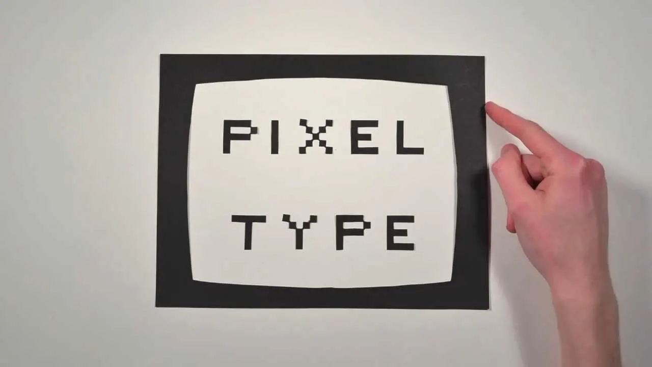
…and a small, concise PDF document (approximately 120g) that I created myself. You can find it here: PDF.
P.S. “Font” can be used as both a masculine and feminine noun!