The geometry of color
Fabio Santaniello Bruun · · Automatically translated from Italian
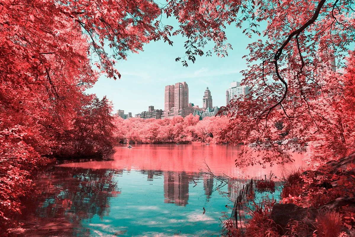
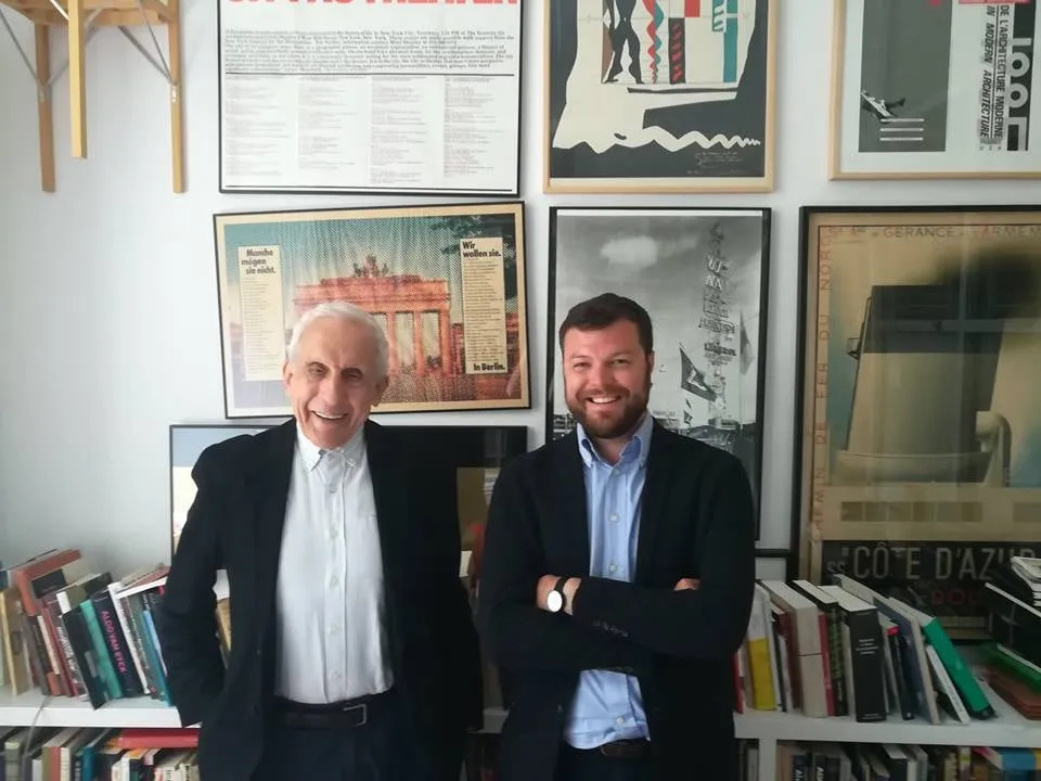
Paolo Pettigiani is a 25-year-old photographer and graphic designer from Turin, Italy. He holds a degree in “Design and Visual Communication” from the Polytechnic University of Turin. His training as a graphic designer and his passion for photography have combined to create a remarkable blend, resulting in a series of photographic projects that range from the abstract, with the pure geometric forms and vibrant colors of “Geometrie,” to the experimental and dreamlike “Infrared NYC” project, which has been featured on major news, graphic design, and design websites such as the Washington Post, Design Boom, Hypebeast Magazine, Colossal, La Repubblica, Wired, and Lonely Planet, among others. We had the opportunity to speak with him.
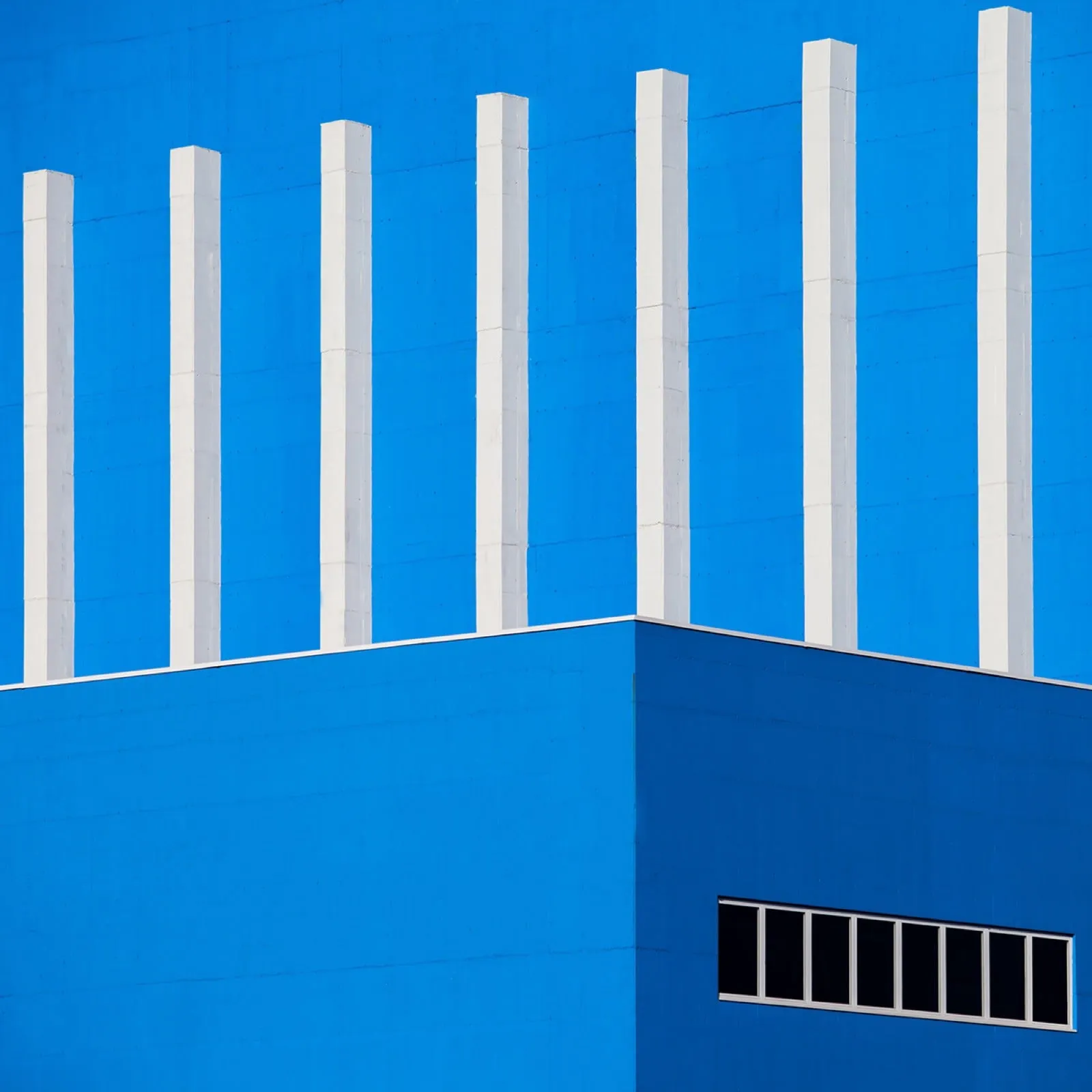 Geometry #1
Your background in visual and graphic design is immediately apparent in your photographs, which reveal a certain passion for pure forms and colors, echoing the latest trends in 3.0 graphic design: flat, vibrant, and clean. But what was the spark that made you see buildings and structures in a new light, structures that you may have been surrounded by your entire life, but that had never spoken to you before?
Certainly, the “thing” that propelled me towards this style was university. Although I didn’t study photography, gradually entering the world of graphic design opened up many avenues for me, filling my head with ideas and new styles. In 2014, I first heard about flat design, and I was immediately fascinated by how it affected the use of colors, spaces, and planes. I began to understand this graphic style better, seeking inspiration on online platforms like Pinterest and Behance. I don’t think there was a single, definitive spark that made me see buildings and structures in a new light, but rather a series of small sparks that, once ignited, illuminated my path. Among the many projects and experiments I undertook and observed, I decided to combine what I was studying (graphic design) with what I was most passionate about (photography) into a single image. This would be a photograph. I spent a period constantly searching for unique, and above all colorful, buildings to capture.
Since I spent almost every day at the university, I didn’t have time to travel and search. Instead, I spent my time on Google Maps, street by street, looking for a building that would be worth starting this project. One day, returning home from the university, I noticed the presence of a newly built industrial complex, composed of large, geometric, and colorful blocks! It was HIM! Without a doubt, I had found the perfect building! I waited another week for the perfect day, needing a clear, blue sky without clouds and very strong light. I went to take the photos during my lunch break, and the first time I realized the beauty and visual power of these images was when I looked through the viewfinder of my Canon, zooming in as much as possible on a corner of the building. I realized that what I was seeing looked like a computer-generated design. The goal had been fully achieved! Even today, when I explain the creation of these images, many people respond: “Ah! Is that a photo?!”
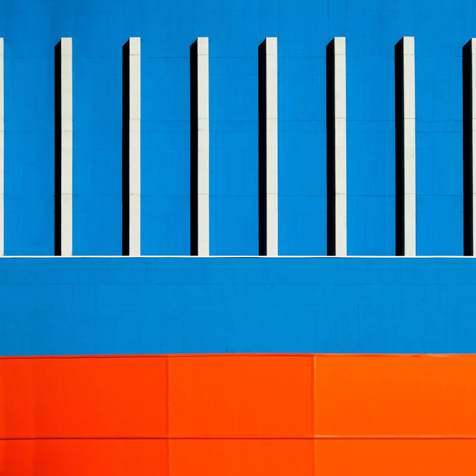 Geometry #1
In the description of “Geometries #1,” you state that “Geometry, minimalism, and graphic design are the essential elements of this work: combined in a single photograph with the intention of decontextualizing the buildings from their surroundings. In this way, the photographs depict a ‘non-place,’ dematerialized from its own physicality.” Why did you feel the need to remove these buildings from time and space? Is this a purely formal and experimental approach, or is it a kind of critique of modern architecture (and the way it integrates into the context)?
No, it is absolutely not a critique of modern architecture; in fact, as you can see in my photographs, I greatly appreciate it. Instead, it is a way of extracting the modern building from the context that surrounds it, seeking to create a perfect image of it in a utopian world of shapes and colors. Especially in this case, speaking of “Geometries #1,” the building photographed is completely foreign to the context in which it is placed, a gray and gloomy industrial area.
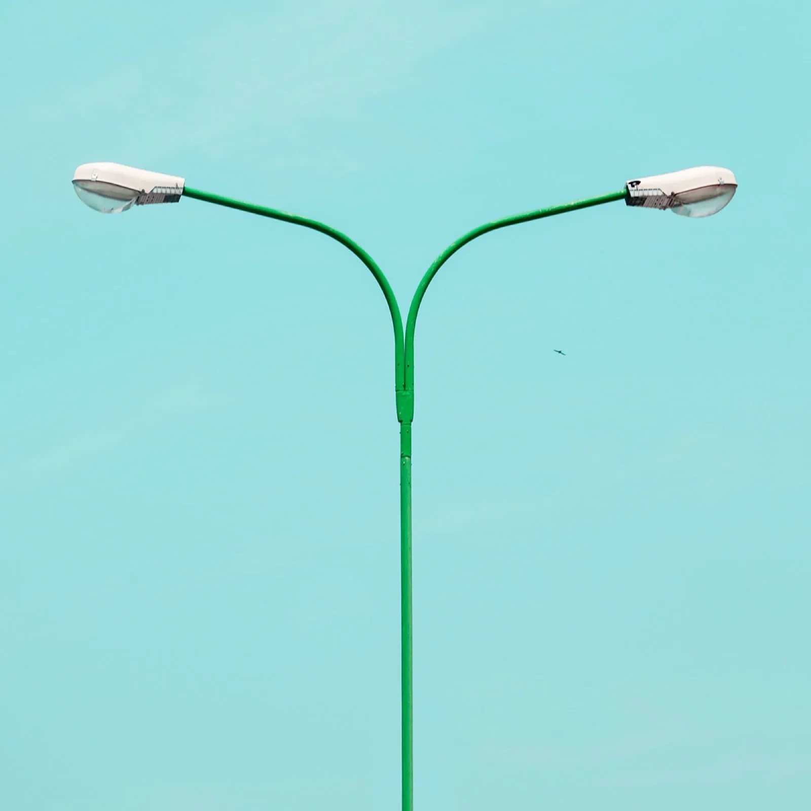 Geometry #2
It’s a kind of battle against the degradation of certain peripheral areas and industrial zones that have lost all character, becoming the “non-places” described by Augé. It feels like a conflict fought with the same weapons. Humans create these uninhabitable and “lost” industrial and peripheral non-places, as Augé tells us, and I, in turn, try to revalue them by creating my own ideal non-place, exploiting the few beautiful features I find in these places.
My goal is not to rehabilitate the periphery, but to see ordinary buildings in a different light, almost trying to disorient the viewer, not just from the location, but from the building itself, which is rendered almost unrecognizable. Whether the buildings are located in the suburbs, in the city center, or immersed in nature, it doesn’t matter. The intention is to extract the building from its environment, creating an imaginary non-place dominated by shapes, colors, and the sky.
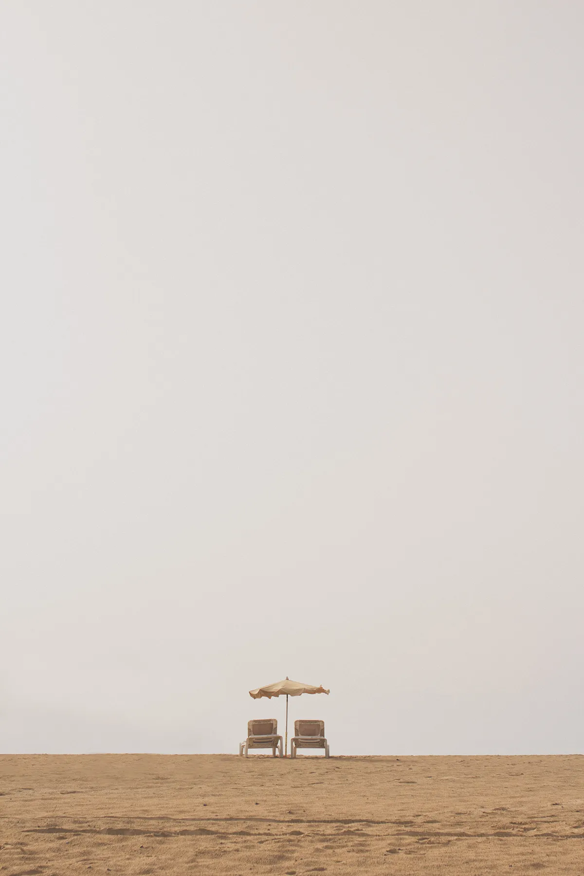 Minimal Fuerteventura
The sky is also a prominent theme in another project. I noticed a consistently innovative approach to subject selection and framing: we change the location and theme, but perhaps we find a similar way of approaching the subject. “Minimal Fuerteventura” impressed me with its compositions that leave room for a vast sky, almost “ignoring” the blue, crystalline sea, the dreamlike landscapes, and other classic subjects of coastal photography. Here too, what led you to tilt the lens so high and show us a smoky sky?
With each photograph, with each project, I want to represent reality from my perspective. In the case of “Minimal Fuerteventura,” I was particularly struck by the spaces that characterize the island. Vast, almost desert-like spaces with beaches that stretch as far as the eye can see. The very low horizon, accompanied only by the sky, was particularly striking. That’s why I decided to compose the photographs in this way, not just on the beach, but also creating this sense of a low horizon with palm trees and buildings.
Infrared NYC
I would like to conclude with a curiosity: despite your young age, you already have many well-crafted and high-quality projects behind you, and, above all, significant recognition from many online platforms, magazines, and positive feedback in galleries and exhibitions regarding your work. I wonder, was it a process from the virtual to the real, or vice versa? In other words, did you first gain a large following on platforms like Behance, or did you achieve success through real-world exhibitions and events, which then translated into online recognition? And speaking of exhibitions, do you have anything planned that you would like to share with us?
I believe that without the internet, and especially without Behance, I wouldn’t have been able to grow so much in the world of photography. Behance is a fantastic platform that connects photographers and creatives from all over the world. When used effectively, it can be a real springboard, as it has been for me. Many blogs and magazines use this platform to find material for new articles and publications, and if you have the ability to create something new and different, you will definitely be noticed, as long as you have the time and patience. My entire career as a photographer started online, and the thousands of followers I have on Behance have helped me to grow even more on this platform and become one of the most visited profiles. Thanks to all this visibility I gained online, over the years I have also been able to translate many things into “real-world” opportunities. Recently, I have had some printed publications, for example, in “La Repubblica” and in “Digital Camera Magazine (UK),” a monthly magazine specializing in photography. I have also been invited to participate in several exhibitions, including one in Turin called “Le4Stagioni,” which will open on October 5th, and another in Paris, in November, coinciding with Paris Photo. In a few weeks, I will also officially begin a collaboration with the LUMAS Gallery, a gallery that promotes emerging artists and will exhibit and sell some photos from the “INFRARED NYC” series.